Scatter plots in Matplotlib
Categories: matplotlib numpy

A scatter graph is used to show the correlation between 2 data series.
In this section we will look at:
- The correlation between temperature and rainfall.
- The correlation between temperatures in 2 different years.
- The correlation between temperature and season.
Scatter graph example
Here is a scatter graph of the daily temperature and rainfall for 2009:
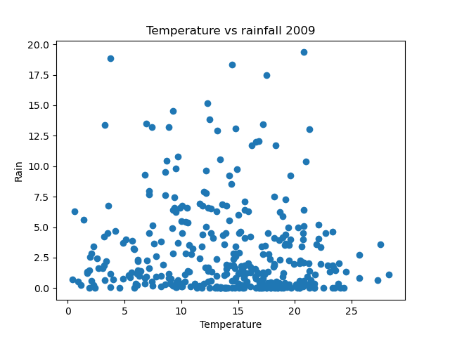
In this graph, each dot represents a single day of the year. The position of the dot shows the temperature and rainfall for that day.
The overall graph doesn't give any indication of which day each dot represents. The set of dots indicates any general trend or relationship between temperature and rainfall.
The points cover almost all of the area, which tells us that there is very little correlation between rainfall and temperature. In the UK it can rain on warm days or cold days, as anyone who lives there will tell you. The only real correlation is that there on the hottest days (when the temperature is above 23 degrees) there is never much rain. That is as expected, it cannot get really hot on a cloudy day, and it cannot rain much unless there are plenty of clouds.
Here is the code to create this plot:
import matplotlib.pyplot as plt
import csv

with open("2009-temp-daily.csv") as csv_file:
    csv_reader = csv.reader(csv_file, quoting=csv.QUOTE_NONNUMERIC)
    temperature = [x[0] for x in csv_reader]

with open("2009-rain-daily.csv") as csv_file:
    csv_reader = csv.reader(csv_file, quoting=csv.QUOTE_NONNUMERIC)
    rain = [x[0] for x in csv_reader]

plt.scatter(temperature, rain)
plt.title("Temperature vs rainfall 2009")
plt.xlabel("Temperature")
plt.ylabel("Rain")
plt.show()
In this code, we read in the two data series, and use plt.scatter to plot the graph.
Scatter graph of temperatures for different years
We can try an alternative scatter graph, based on the daily temperatures of 2009 versus the daily temperatures of 2010. Here is the result:
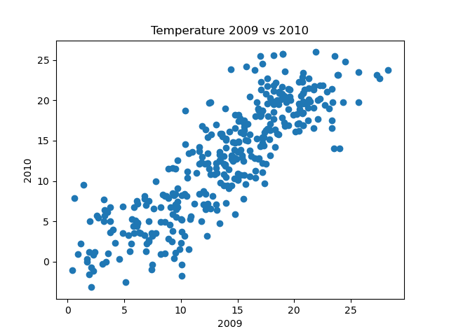
As you might expect, there is some correlation between the temperatures in 2009 and the temperatures in 2010. This is not surprising, the days at any particular time of year will tend to be broadly similar from one year to the next (it is usually col din January, for example).
We wouldn't expect an exact correlation, because individual days will vary, and there is no reason to expect the daily variations to be exactly replicated the following year.
Here is the new code:
import matplotlib.pyplot as plt
import csv

with open("2009-temp-daily.csv") as csv_file:
    csv_reader = csv.reader(csv_file, quoting=csv.QUOTE_NONNUMERIC)
    temperature_2009 = [x[0] for x in csv_reader]

with open("2010-temp-daily.csv") as csv_file:
    csv_reader = csv.reader(csv_file, quoting=csv.QUOTE_NONNUMERIC)
    temperature_2010 = [x[0] for x in csv_reader]

plt.scatter(temperature_2009, temperature_2010)
plt.title("Temperature 2009 vs 2010")
plt.xlabel("2009")
plt.ylabel("2010")
plt.show()
All we have done here is read the data sources from different files, and updated the graph labels and titles.
Marking the seasons
We can add more information by varying the colour of the dots according to the season. Here is an example graph:
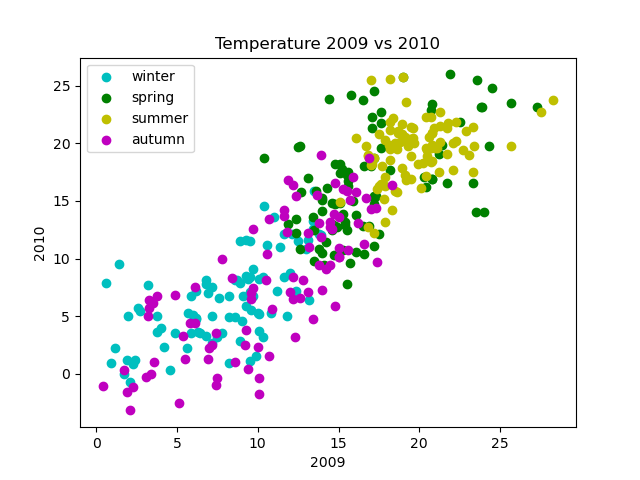
In this graph, the days of each season are marked in different colours. This gives us more information than the previous graph. For example, summer days are mainly warm and winter days are mainly cold, with spring and autumn somewhere in between, which is as you would expect.
Here is the code:
import matplotlib.pyplot as plt
import csv

with open("2009-temp-daily.csv") as csv_file:
    csv_reader = csv.reader(csv_file, quoting=csv.QUOTE_NONNUMERIC)
    temperature_2009 = [x[0] for x in csv_reader]

with open("2010-temp-daily.csv") as csv_file:
    csv_reader = csv.reader(csv_file, quoting=csv.QUOTE_NONNUMERIC)
    temperature_2010 = [x[0] for x in csv_reader]

plt.scatter(temperature_2009[0:90], temperature_2010[0:90],
            color="c", label="winter")
plt.scatter(temperature_2009[90:181], temperature_2010[90:181],
            color="g", label="spring")
plt.scatter(temperature_2009[181:273], temperature_2010[181:273],
            color="y", label="summer")
plt.scatter(temperature_2009[273:365], temperature_2010[273:365],
            color="m", label="autumn")
plt.title("Temperature 2009 vs 2010")
plt.xlabel("2009")
plt.ylabel("2010")
plt.legend(loc="upper left")
plt.show()
The graph is made up of 4 separate scatter graphs, all on the same axes. We split the year data into 4 separate slices. For example this code plots days 0 to 89:
plt.scatter(temperature_2009[0:90], temperature_2010[0:90],
            color="c", label="winter")
We set the colour to c for cyan (a nice icy blue). The first 90 days correspond to the months January, February, and March, which we will call winter (actually winter goes from the 21 December to the 20 March, but we will round it to the nearest month to simplify the code).
We plot the other 3 seasons in a similar way, using different colours.
Styling scatter plots
We can style a scatter plot in a similar way to a line plot or stem plot, with the following optional parameters:
- The
fmtparameter uses a string to specify basic colour, and marker shape options. Use this for simple formatting. - The
colorparameter sets the line colour, using named colours of RGB values. Thecparameter does the same thing but is shorter. - The
marker,markeredgecolor,markeredgewidth,markerfacecolor, andmarkersizecontrol the marker appearance.
It is also possible to add lines to a scatter chart. The line will connect the points in the order they appear in the data. This is usually only useful if the data has some kind of natural order. Most scatter charts don't include lines.
These options are covered in more detail in the article line and marker styles.
Related articles
Join the GraphicMaths/PythonInformer Newsletter
Sign up using this form to receive an email when new content is added to the graphpicmaths or pythoninformer websites:

Popular tags
2d arrays abstract data type and angle animation arc array arrays bar chart bar style behavioural pattern bezier curve built-in function callable object chain circle classes close closure cmyk colour combinations comparison operator context context manager conversion count creational pattern data science data types decorator design pattern device space dictionary drawing duck typing efficiency ellipse else encryption enumerate fill filter for loop formula function function composition function plot functools game development generativepy tutorial generator geometry gif global variable greyscale higher order function hsl html image image processing imagesurface immutable object in operator index inner function input installing integer iter iterable iterator itertools join l system lambda function latex len lerp line line plot line style linear gradient linspace list list comprehension logical operator lru_cache magic method mandelbrot mandelbrot set map marker style matplotlib monad mutability named parameter numeric python numpy object open operator optimisation optional parameter or pandas path pattern permutations pie chart pil pillow polygon pong positional parameter print product programming paradigms programming techniques pure function python standard library range recipes rectangle recursion regular polygon repeat rgb rotation roundrect scaling scatter plot scipy sector segment sequence setup shape singleton slicing sound spirograph sprite square str stream string stroke structural pattern symmetric encryption template tex text tinkerbell fractal transform translation transparency triangle truthy value tuple turtle unpacking user space vectorisation webserver website while loop zip zip_longest