Fitting a line to a scatter plot in Matplotlib
Categories: matplotlib numpy scipy

In this article we see how to fit a straight line to the data in a scatter plot.
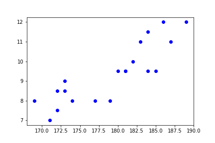
As a simple example of a scatter plot, for a group of people, we might record their height and their shoe size. A scatter plot would then consist of one dot for each person, indicating their height (x) and shoe size (y).
Here is the code to create a scatter plot:
import matplotlib.pyplot as plt

height = [172, 171, 174, 169, 172, 173, 173, 177, 182, 180,
          181, 179, 183, 181, 186, 184, 185, 189, 184, 187]
shoe = [8.5, 7.0, 8.0, 8.0, 7.5, 9.0, 8.5, 8.0, 10.0, 9.5,
        9.5, 8.0, 11.0, 9.5, 12.0, 11.5, 9.5, 12.0, 9.5, 11.0]

plt.plot(height, shoe, 'bo')
plt.show()
We are using the plot function to create the scatter plot. The key thing here is that the fmt string declares a style 'bo' that indicates the colour blue and a round marker, but it doesn't specify a line style. A marker style with no line style doesn't plot lines, showing just the markers.
Each (x, y) pair of values corresponds to the height and shoe size of one person in the study. So in the example data, the first person has height 182 cm and shoe size 8.5, the next person has height 171 cm and shoe size 7, and so on. The data uses UK shoe sizes, other countries use a totally different system with very different numbers.
Here is the graph it creates:
Fitting a straight line
When we fit a straight line, we try to find a line that best represents the data. It will be an approximation because the points are scattered around so there is no straight line that exactly represents the data.
A common way to find a straight line that fits some scatter data is the least squares method.
For a given set of points (xn, yn) and a line L, for each point you calculate the distance, dn, between the point and the line, like this:
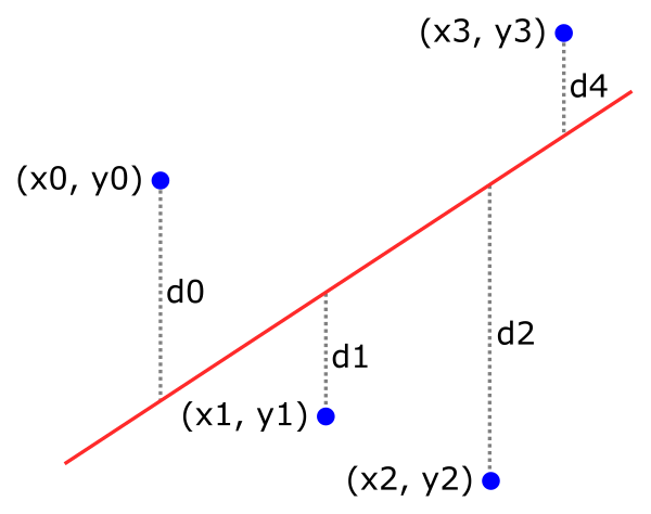
We can then calculate the sum of the squares of the distances:
s = d0*d0 + d1*d1 + d2*d2 ...
This sum is a measure of the total error of the line fit. The best line is the one that has the smallest s value.
There is a formula for finding the best fit of a line to a set of (x, y) data points, and fortunately NumPy has an implementation of that formula:
import numpy as np

m, c = np.polyfit(height, shoe, 1)
print(m, c)                # 0.21234550158091434 -28.65607933314174
polyfit takes an array of x-values, an array of y-values, and a polynomial degree. Setting the degree to 1 gives a straight line fit.
The m and c values plug into the standard equation of a straight line:
y = m*x + c
This is a line that crosses the y-axis at c and has a slope of m. Using the values from the code above, the line is approximately:
y = 0.21235*x - 28.656
Plotting the straight-line fit
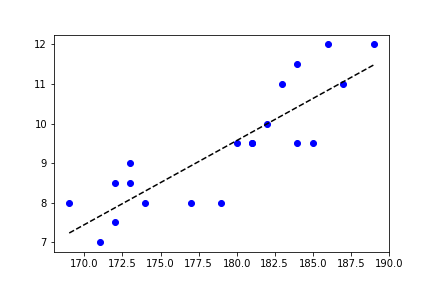
Returning to the original single data, we can now add a straight line fit to the data. We simply need to choose two values for x, and calculate the corresponding values for y. We can then draw a line that joins the two points
- When
xis 169,yis about 7.23 - When
xis 189,yis about 11.48
Here is the code to plot the scatter chart and the fitted line:
import matplotlib.pyplot as plt

height = [172, 171, 174, 169, 172, 173, 173, 177, 182, 180,
          181, 179, 183, 181, 186, 184, 185, 189, 184, 187]
shoe = [8.5, 7.0, 8.0, 8.0, 7.5, 9.0, 8.5, 8.0, 10.0, 9.5,
        9.5, 8.0, 11.0, 9.5, 12.0, 11.5, 9.5, 12.0, 9.5, 11.0]

plt.plot(height, shoe, 'bo')
plt.plot([169, 189], [7.23, 11.48], 'k--')
plt.show()
We have added a plot containing the two points, with a style of "k--", which creates a black, dashed line.
Here is the result. The scatter plot is drawn as before, but we also draw a black, dashed line that represents the best fit of a straight line to the data:
Related articles
Join the GraphicMaths/PythonInformer Newsletter
Sign up using this form to receive an email when new content is added to the graphpicmaths or pythoninformer websites:

Popular tags
2d arrays abstract data type and angle animation arc array arrays bar chart bar style behavioural pattern bezier curve built-in function callable object chain circle classes close closure cmyk colour combinations comparison operator context context manager conversion count creational pattern data science data types decorator design pattern device space dictionary drawing duck typing efficiency ellipse else encryption enumerate fill filter for loop formula function function composition function plot functools game development generativepy tutorial generator geometry gif global variable greyscale higher order function hsl html image image processing imagesurface immutable object in operator index inner function input installing integer iter iterable iterator itertools join l system lambda function latex len lerp line line plot line style linear gradient linspace list list comprehension logical operator lru_cache magic method mandelbrot mandelbrot set map marker style matplotlib monad mutability named parameter numeric python numpy object open operator optimisation optional parameter or pandas path pattern permutations pie chart pil pillow polygon pong positional parameter print product programming paradigms programming techniques pure function python standard library range recipes rectangle recursion regular polygon repeat rgb rotation roundrect scaling scatter plot scipy sector segment sequence setup shape singleton slicing sound spirograph sprite square str stream string stroke structural pattern symmetric encryption template tex text tinkerbell fractal transform translation transparency triangle truthy value tuple turtle unpacking user space vectorisation webserver website while loop zip zip_longest